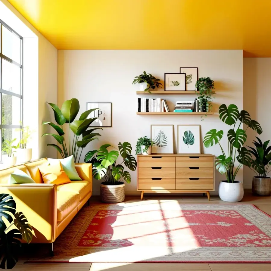
I see it all the time. Someone falls in love with a kitchen color palette on Pinterest, paints every wall a moody plum, and then realizes they can’t find a single utensil because the room feels like a cave at midnight. Or they go all in on sunlit terracotta without checking how it behaves under their weird overhead fluorescent bulb, and suddenly their kitchen looks like a greasy pizza box. These kitchen color palettes from moody plums to sunlit terracotta are seriously inspiring, but there’s a sneaky gap between the pin and the reality. Let me walk you through the common mistakes people make when picking colors for a kitchen refresh, and more importantly, how to dodge them without losing the dreamy vibe.
Mistake #1: Going Full Gothic Without a Safety Rail
Ok so you love dark, broody colors. Moody plums, deep aubergines, almost-black charcoal. I get it. They look incredible in a mood board. But here’s the thing: painting your kitchen in a full dark palette without any breathing room is like wearing a heavy wool coat in July. It’s suffocating. I tried a dark eggplant on the lower cabinets of my last apartment and honestly, I had to open every window just to make a cup of tea. Not great.
How to avoid it? Use dark colors as an accent, not the whole meal. Paint the island that gorgeous plum. Do one wall behind the stove. Let the rest of the room stay lighter, or at least introduce plenty of natural wood and metallic reflectors. Your kitchen will still feel moody, but not like you’re inside a grape.
Mistake #2: Ignoring the Undertone Trap
You pick a terracotta that looked soft and clay-like in the store. You get it home and it screams bright orange, like a traffic cone. That’s because you ignored the undertone. Every color has a secret little relative hiding inside, a hint of blue, yellow, red, green. Terracotta can lean toward burnt sienna (warm, earthy) or toward hot paprika (aggressive, loud). Sage green? Could be calming or sickly grey, depending on whether it’s carrying too much yellow or too much blue.
My friend Sarah painted her whole kitchen a “soft clay” shade, and swear to god, it turned out the exact color of raw chicken. We laughed, but she cried. Learn from her. Always compare your chosen color next to pure white, pure black, and a piece of wood. If the undertone pops out like an unwanted guest, pick a different shade. Don’t trust the chip. Trust your eyes under your own lights.
Mistake #3: Forgetting You Cook in That Room
Here’s something Pinterest never shows you: the steam. The grease. The splatters. Certain kitchen color palettes look stunning in a staged photo, but they show every fingerprint. Dark matte finishes? Beautiful, but you’ll be wiping them down after every single boiled egg. Soft pale clay tones? Gorgeous until tomato sauce decides to redecorate your backsplash.
I’m not saying you have to be boring. But if you’re going with a light, creamy palette, consider semi-gloss or satin finishes for the walls and cabinets. They wash. They survive. And for those sunlit terracotta walls, use a durable paint that can handle a sponge. Your future self, after a spaghetti explosion, will thank you. Honestly, I’d rather have a practical kitchen that looks 90% as good as the dream version but stays clean for more than five minutes.
Quick Fixes Before You Commit (A Bullet List for Sanity)
- Buy a sample pot. Paint a 2-foot square on the wall. Live with it for three days. Watch it at dawn, noon, and after a pasta dinner.
- Hold your color choice next to your countertops, backsplash, and floor. If they fight, one of them has to go. Usually it’s the paint, because tile is expensive and a pain to rip out.
- Check how the color looks under both warm white and cool white bulbs. You don’t want your moody plum turning into a bruised banana at night.
- Take a photo in natural light. The camera phone lies, but it lies less than your memory.
Mistake #4: Matching Everything Instead of Telling a Story
You’d think color harmony means everything matches perfectly. Nah. That’s how you get a kitchen that feels like a hotel lobby, not a home. Real harmony has contrast. It has tension. A warm terracotta needs a cool sage green or a dusty blue to make it sing. A moody plum loves being next to a soft blush or a warm grey, otherwise it falls flat.
Here’s a weird tip: pick three colors, but make them unequal. One dominant (the wall color), one secondary (cabinets or island), one pop (backsplash, stools, a kettle). Do not give all three the same weight. The pop should be a surprise, not a shout. I once saw a kitchen with terracotta walls, olive green cabinets, and a bright cobalt blue range. Sounded insane. Looked incredible. Because the colors told a story, not a chart.
Mistake #5: Chasing the Trend Instead of Your Own Mood
I know, I know. Social media screams “moody plum! sunlit terracotta! sage everything!” But trends are like jeans. They fit some people and make others look like a bag of potatoes. Your kitchenaesthetic should reflect how you actually want to feel when you’re unloading the dishwasher. Do you want calm? Go with soft, muted hues. Do you want energy? Then lean into that terracotta with some warm yellow undertones. Do you want cozy? A deeper plum with warm wood can feel like a hug.
I almost painted my own kitchen a trendy dusty rose last year. Then I realized I’d have to look at it every morning when I’m barely awake and grumpy. I needed something grounding, not romantic. I went with a muted olive instead. No regrets. So ask yourself: what mood do I want when I’m cooking at 6pm on a Tuesday? Let that answer guide you, not a viral pin. That’s real kitchenmood work.
Mistake #6: Ignoring the Flow Between Rooms
Your kitchen doesn’t exist in a bubble. Unless you live in a mansion with closed doors, the color will bleed visually into the dining area or living room. That dramatic plum kitchen might look great by itself, but if it opens into a bright white living room with beige furniture, the transition will feel like a slap. I’ve been in houses where the kitchen color palette clashes with the adjacent hallway so badly you feel dizzy walking through.
Solution: pull one color from the next room and echo it in your kitchen in a lighter or darker form. If your living room has greige walls, use a deeper greige on your kitchen island. Or if you’re set on that bold terracotta, bring a whisper of it into the adjoining space with a throw pillow or a piece of art. Unify, don’t segregate. Your kitchendesignideas should flow like a conversation, not a shouting match.
Mistake #7: Forgetting the Ceiling and the Floor
Ok this is a weird one, but hear me out. Everyone obsesses over wall colors and cabinet paint. Then the floor is ignored. The ceiling is white. And suddenly your beautiful color scheme feels incomplete, like a song with no bassline. A warm terracotta kitchen with a cool grey floor? The energy gets confused. A moody plum with a honey-toned wood floor? Now we’re talking.
You don’t have to repaint the ceiling a wild color. But consider a warm white with a hint of cream instead of stark hospital white. And please, for the love of all things holy, match your floor tone to your palette’s undertone. Warm floors for warm colors. Cool floors for cool colors. It’s subtle, but it’s the difference between a kitchen that feels designed and one that feels thrown together. I learned this after installing a grey floor in my warm-toned kitchen and literally hated it for two years until we replaced it. Don’t be me.
Final Thought: You Can Always Paint Again
Look, paint is not permanent. It’s not tile. You can mess up, laugh, and repaint next weekend. The worst that happens is you waste a weekend and a few gallons. So don’t get paralyzed by the perfect kitchencolorpalettes you see online. Pick one you love, test it, adjust it, and go for it. The stories your kitchen tells, the light it catches, the way it makes you feel when you walk in at 7am, that’s what matters. Start with the mood you want, avoid the mistakes I mentioned, and your kitchen will be more than just pretty. It’ll be yours.
Save this article to your Pinterest board, and when you finally paint those cabinets, tag me. I want to see the wreckage or the triumph, honestly either one. I’ve been there.
#kitchencolorpalettes #kitchenmood #colorharmony #kitchendesignideas #kitchenaesthetic