Finding Your Neutral Balance in a White Kitchen
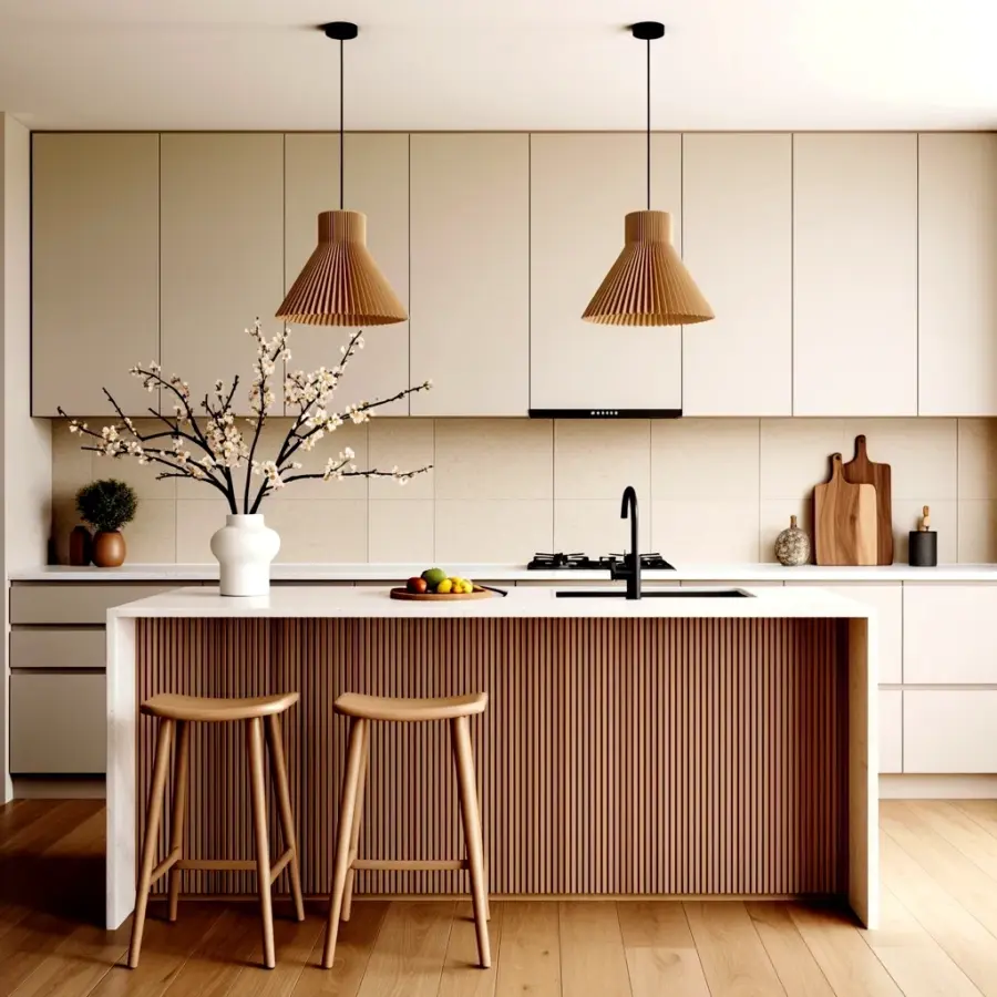
Look, I’ve styled a lot of kitchens over the years. But when I saw this exact setup with the white kitchen island decor, those beige pendant lights, and the raw wood slat base, something clicked. It’s not just white. It’s warm. It’s quiet. The photo shows a modern minimalist kitchen with pale beige upper cabinets and those huge backsplash tiles that catch the light. There’s a black faucet standing bold next to a white vase of dried cherry blossoms. Honestly, the whole thing feels like a deep breath. And the best part? You can recreate this look with a few concrete steps. No design degree required.
Ok so the real trick here is restraint. You need to stick to two or three neutral tones. Maybe three if you count the wood. That’s it. White, beige, and natural wood. That’s the whole palette. But getting them to work together without the room feeling flat? That takes some precise moves. Let me walk you through exactly how to pull it off.
Hanging Beige Pendant Lights That Feel Soft, Not Dingy
I’m picky about pendant lights. Too bright and they ruin the mood. Too dark and your island looks like a cave. The ones in this kitchen are beige pleated shades, hanging from a white ceiling. They cast a warm glow that doesn’t compete with the white quartz surface below. Here’s the thing: beige can look muddy if the undertone is wrong. You want a beige that leans warm but not yellow. Think sandy linen, not mustard.
When you choose pendant lights for your white kitchen island decor, pay attention to the shade material. Pleated fabric or linen softens the light. Metal would bounce it harshly. And hang them low enough that the bottom of the shade is about 30 to 36 inches above your countertop. I once hung mine too high and the whole room felt disconnected. Move them down. It makes the island feel anchored.
One weird thing I noticed in the photo: the shades are identical, evenly spaced. Don’t get cute with mismatched pendants here. Symmetry keeps the calm. Save asymmetry for a more eclectic style.
Why a Wood Slat Base Works Under a White Kitchen Island
I’ll be blunt: a white island can look like a block of ice if there’s no texture. That wood slat base in the picture? It saves the whole design. The vertical planks add rhythm and warmth without adding color. They break up the expanse of white quartz. And they tie into the wooden bar stools that sit nearby. It’s a cohesive move.
But not all wood slats are created equal. You want a matte finish. No high gloss. Go for oak or ash, something with a visible grain. The slats should be thin, maybe 3 to 4 inches wide, with a small gap between each. That gap lets the eye breathe. If you glue them solid, it just looks like a wall. Trust me, I tried it. Looked like a sauna wall. The spacing is everything.
Also, the wood shouldn’t match the floor exactly. It should be a shade or two different. In the photo, the floor is lighter. The island base is richer. That contrast gives depth. Without it, the whole room blurs into one beige blob. So pick a wood tone that’s noticeably darker than your flooring. Not much. Just enough.
Pairing Beige Upper Cabinets With White Quartz
The upper cabinets in this kitchen are a light beige, flat panel, no hardware showing. That’s key. If you put shiny brass pulls on a beige cabinet, you get a traditional look. Here, they wanted modern minimalist. So they kept the fronts clean. The beige is subtle. It’s almost white but not quite. That whisper of color is what stops the all-white kitchen from feeling sterile.
When you’re choosing cabinet paint, get samples. Paint a big board and look at it in morning light and evening light. Beige can swing pink or green under fluorescents. I once painted a whole kitchen a “soft beige” that turned lavender at night. It was awful. Don’t be me. Pick a beige with a neutral base. Benjamin Moore’s “Accessible Beige” or Sherwin-Williams’ “Balanced Beige” are safe bets. They play nicely with white quartz.
And yes, the quartz should be white. Not cream, not off-white. Pure white with maybe a tiny speckle. The contrast between the crispy white island and the soft beige cabinets creates that layered look. It’s deliberate. It’s not an accident.
Large Format Backsplash Tiles That Don’t Fight the Cabinets
Notice the backsplash in the photo: large format tiles in beige. They’re not small subway tiles. They’re big, maybe 12×24 inches or larger. Fewer grout lines means fewer visual interruptions. That clean surface lets the beige sit quietly behind the countertop. It’s almost a background player, but it’s doing the heavy lifting of tying the upper cabinets to the island.
Here’s a practical tip: if your cabinets are beige and your backsplash is also beige, they need different finishes. In the picture, the cabinets are matte. The backsplash tiles are glossy or semi-gloss. That slight sheen catches light and keeps the two surfaces distinct. If everything were matte, it would look like one giant wall of beige mud. Not good.
I recommend a rectified porcelain tile for this job. It has sharp edges, so you can install it with thin grout lines (1/16 inch). That grout should be a warm white, not a stark white. Again, subtle. Keep the palette small. You’re aiming for three tones maximum: white, beige, wood. That’s your whole universe here.
Dried Cherry Blossoms and a Black Faucet: The Contrast Pair
Alright, let’s talk about that little vignette on the island. A white ceramic vase with dried cherry blossom branches, small white flowers mixed in. Beside it, a black faucet. That’s the only dark element in the whole kitchen. And it works because it’s a single point of contrast. Too many black accents would overwhelm the softness. One black faucet, black stool legs maybe, that’s enough.
The dried cherry blossoms add an organic, slightly Japanese feel. They’re not bright pink. They’re muted, almost greyish pink. That’s important. If you put fresh hot-pink flowers here, it would scream. Dried florals keep the tone subdued. And they last for months. I have a bundle of dried hydrangeas on my own counter that I haven’t touched since last fall. Perfectly fine.
One weird personal thing: I once spent an entire afternoon trying to get dried stems to stay upright in a vase. They kept flopping over. Not gonna lie, it was maddening. But I learned you need a narrow-necked vase or some floral tape under the rim. That white vase in the photo looks like it has a small opening. That’s on purpose. It forces the branches upward. Don’t underestimate the physics of dried flowers. Anyway, pick a vase that’s heavy enough not to tip when you bump it while washing dishes.
And the small plate with fruits? Probably green apples or pears. Another muted pop. Nothing too bright. If you want to copy this, put out a piece of fruit that’s not screaming for attention. A lemon is too loud. A green apple, quiet. See the pattern? Everything whispers.
Styling the Island Surface Without Cluttering It
Here’s the hardest part: keeping the island clean while still having a life on it. In the photo, there’s a vase, a fruit plate, and a black faucet. That’s it. No utensil crock. No cookbook stand. No salt and pepper grinders. The empty space around those objects is just as important as the objects themselves.
When you style your own white kitchen island decor, follow the rule of three. Put down one tall item (the vase), one medium item (the fruit plate), and one functional item (the faucet). Don’t add a fourth. The moment you put a fourth object, it starts to look like a flea market. I’ve done it. I had a tiny herb plant, a mortar and pestle, a coffee mug, and a spoon rest. It was chaos. My husband said it looked like a yard sale. He wasn’t wrong.
So clear the island. Leave most of it bare. Let the white quartz shine. The beige pendants and wood slat base are already doing the heavy lifting. Your job is just to not mess that up. A single tray can hold a few small items if you absolutely need them. But I’d argue you don’t. Let the kitchen breathe.
- Use only 2-3 neutral tones: white, beige, wood.
- Hang pendant lights 30-36 inches above the counter.
- Choose wood slats with gaps, matte finish, darker than floor.
- Pick cabinets a shade off from the backsplash for contrast.
- Add one dark accent, like a black faucet, for grounding.
- Limit island decor to three items max. Keep it spare.
One Last Thought on the Overall Vibe
This style works because it’s calm without being boring. Every element has a reason. The wood adds texture. The beige adds warmth. The white adds airiness. The black adds a tiny pop. It’s a system. And if you follow these steps, you can get there without guessing.
Start with the pendants and the wood base. Those are the anchors. Then pick your cabinet and backsplash colors carefully. Sample them together. Then add one floral accent and one dark fixture. Step back. If it feels too plain, add a cozy stool or a soft rug. But resist the urge to clutter. That’s the whole secret. Look at the photo again. Notice how much empty space there is. That’s deliberate. That’s the calm.
If you’re working on your own kitchen right now, I’d love to hear how it goes. Drop a comment or tag me in your photos. It’s always nice to see someone else get the same peaceful feeling from a neutrally styled space.
#whitekitchen #beigekitchen #neutralhome #kitchenstyling #minimalistkitchen
Leave a Comment