Avoiding the Biggest Mistake: Choosing the Wrong Cabinet Profile for a Clean Look
You see those dreamy all-white kitchens on Pinterest and think it’s just about white paint. That’s the first slip-up. The real trick is in the cabinetry lines. A flat slab door gives you a modern, almost museum-like elegance. But many people pick a door with too much detail, like a raised panel with ornate beading. That creates visual noise, especially if your stone is already busy. For the white kitchen aesthetic, you want the eye to rest, not dart around.
Stick to shaker-style doors or flat-panel fronts. They keep the silhouette clean. If you’re worried about it feeling boring, play with the cabinet height. Take cabinets all the way to the ceiling. This eliminates that awkward dust-collecting gap above and draws the eye upward, making the room feel taller and more intentional.
The Stone Selection Trap: Why Veining Can Ruin the Aesthetic
White marble or quartz looks so soothing in photos. But here is the honest truth: too much veining, or veining in the wrong color, can make your kitchen look like a hospital waiting room or a cheap print. The mistake is treating stone as an afterthought. Instead, use it as the anchor. A white kitchen with a crisp statuary marble (white background with fine grey veins) feels timeless. A busy quartz with gold veins? That dates fast and fights the clean aesthetic.
If you love movement, pick one focal point. Maybe the island gets a bold stone, while the perimeter counters stay a solid white quartz. And always, always bring a sample of your cabinet door to the stone yard. You need to see how the undertones sit together. A warm white cabinet with a cool white marble can look dingy.
Countertops That Scream Clutter: The Overcrowding Mistake
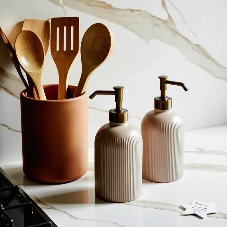
Here is the number one enemy of a white kitchen aesthetic: stuff on every surface. Coffee maker, knife block, fruit bowl, utensil holder, paper towel stand. It turns your serene white kitchen into a dorm room. The fix is brutal but necessary. Designate a drawer or a cabinet for every single appliance you use daily. Yes, even the toaster.
For the items you absolutely need out, pick one zone. Keep the coffee station near the sink, and limit it to one machine plus a small canister. Use a tray to corral them so they feel like a set, not a mess. And your countertop stone? Let it breathe. A clean white kitchen needs empty surface area to show off the material. If you can’t see the stone, you lost the game.
Forgetting the Warmth Element: Why Your Kitchen Feels Cold
White kitchens get a bad reputation for feeling sterile. That happens when every single thing is white and hard: white cabinets, white quartz, white tile, white paint. You need one natural material to soften the look. Wood is the classic choice, but I see people misplace it. They add a big dark wood island that competes with the white cabinetry. That is a mistake.
Instead, use wood in small, deliberate doses. A single open shelf in warm oak. A kitchen stool with a natural seat. A chopping board leaned against the backsplash. If wood isn’t your thing, go with greenery. A tall olive tree or a small potted herb on the windowsill adds life. The element should be singular and quiet, not loud. It is the seasoning, not the main dish.
The Backsplash That Breaks the Calm: Pattern Overload
Square white subway tile is a safe bet, but safe can also be boring. So people overcorrect with a busy mosaic or a dark grout that shouts. That grout line, if dark, creates a grid that competes with your clean cabinet lines. For the white kitchen aesthetic, you want the backsplash to disappear, not perform. A simple zellige tile in a creamy white with subtle variations gives texture without screaming.
If you want a pattern, keep it restrained. A herringbone lay with standard subway tile in white is elegant. Or use a long, thin tile (like a brick stack) to stretch the visual width of the room. The rule: your backsplash should be the background, not the focal point. If your stone countertop has a lot going on, go completely plain on the wall. Let the stone be the star.
Lighting That Fails the Space: The Overhead Only Problem
You spent hours picking the perfect white cabinet and stone, and then you install one overhead light fixture that casts shadows on everything. That is a classic mistake. White kitchens, especially, need layered lighting because the walls reflect so much light, but the countertops and cabinets can fall into shadow if the source is too high or too central.
Install under-cabinet lighting. Seriously, this is the single best upgrade for a white kitchen. It makes the countertop stone glow and eliminates dark corners. Add a pendant over the sink or island that has a soft, warm bulb. Avoid cool white LED that looks like a hospital. Warm dimmable bulbs (2700K to 3000K) make the white feel soft and inviting. Test the light with your stone sample before finalizing.
- Do not choose cabinet doors with heavy ornamentation. Stick to flat or shaker profiles.
- Do not pick stone with chaotic veining. Choose a calm marble or a solid white quartz.
- Do not clutter the countertops with gear. Store daily appliances out of sight.
- Do not forget a natural element. One piece of wood or a living plant makes the room feel alive.
- Do not install a busy backsplash. Let the stone and cabinets lead the visual story.
- Do not rely on a single overhead light. Add under-cabinet and warm accent lighting.
When Less Becomes Boring: The Lifeless White Trap
I have seen kitchens that are all white but feel like a dentist’s office. The mistake? No variation in texture. If your cabinets are glossy white, your stone is polished white, your backsplash is glossy tile, and your paint is flat white, you get no depth. The eye has nothing to hold onto. You need contrast in finish. Mix matte cabinets with a honed stone (dull finish) for a soft look. Or keep cabinets matte and let the stone have a subtle polish.
Another fix is your hardware. Avoid chrome or silver if your stone has warm tones. Brushed brass or unlacquered brass in a simple shape adds a tiny pop of character without ruining the white kitchen aesthetic. And for the love of clean lines, skip the ornate cabinet pulls. A simple bar pull or a small knob keeps the look cohesive. Every detail counts.
Getting the white kitchen aesthetic right is about editing. It is about making each choice deliberate and then stopping. You don’t need a thousand accessories. You need good bones and a few thoughtful touches. If you save this for your kitchen refresh, start with the cabinetry profile and the stone selection, then build from there. The rest is just keeping the counters clear and adding one warm piece. That is it.
#whitekitchen #kitchenstyling #kitchenaesthetic #interiordesign #homeinspo
Leave a Comment